
Today’s world bombards people with content. In order to make a new site or ad stand out among the others, it must bring a little something extra to the table. Most websites utilize symmetry to their advantage, but creators forget that asymmetry can be just as effective. Symmetrical design has become commonplace, so asymmetry can be an eye-popping way to garner extra attention.
Unfortunately, asymmetry can be a difficult concept to master, leading many designers to dismiss it altogether. When designers shed their misconceptions and give it a chance, they expand their horizons and create more memorable content.
Learn Web Design Series
Welcome back to our series on learning to be a web designer. Remember from last time that we’re not talking about code, like HTML and CSS, but the foundational principles of design. Simple lessons that will improve your ability to create an aesthetically pleasing end product for your clients. Here are a couple of other posts in this series:
Using White Space
One common misconception about white space is that it has to be white. It can be any color, so it is more accurately referred to as negative space. Any space in a design that is not occupied by the subject(s) of the image qualifies as negative space. Many creators feel the need to cover this space in order to make an image complete.
In reality, the completeness of a piece has nothing to do with the amount of content on each side. The blank space on one side can balance the content on the other. When used correctly, this tactic makes a big impact. This method intrigues people because they are not accustomed to seeing it. Unfortunately, creating a balanced asymmetrical piece is not as simple as it sounds.
Creating Asymmetrical Balance
Common Practices
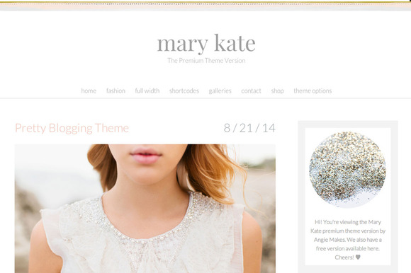
The terms “asymmetrical” and “off-balance” are not interchangeable. Designs that lack symmetry are still capable of balance. Most asymmetrical designs use text to fill in the blank areas, like in this example. The theme uses a text block on the right to balance out the image on the left. This is a well-executed design, but designers should remember that white space is not wasted space, and it doesn’t always need to be covered up.
Blank, Not Boring
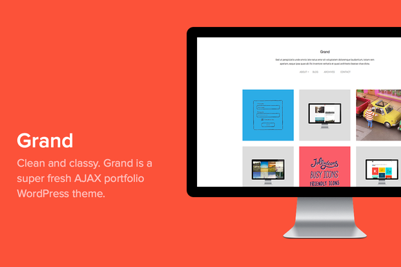
When utilizing blank space, designers must not forget the importance of balance. The amount of white space appropriate for a page is entirely dependent upon the size of the subject. This theme from Creative Market demonstrates how proper asymmetrical balance can automatically bring the viewer’s eye to the focal point. Since human eyes usually migrate to the left of the page first, this design emphasizes the text. The page looks clean and well-organized despite the fact that it is asymmetrical.
Asymmetry and Minimalism
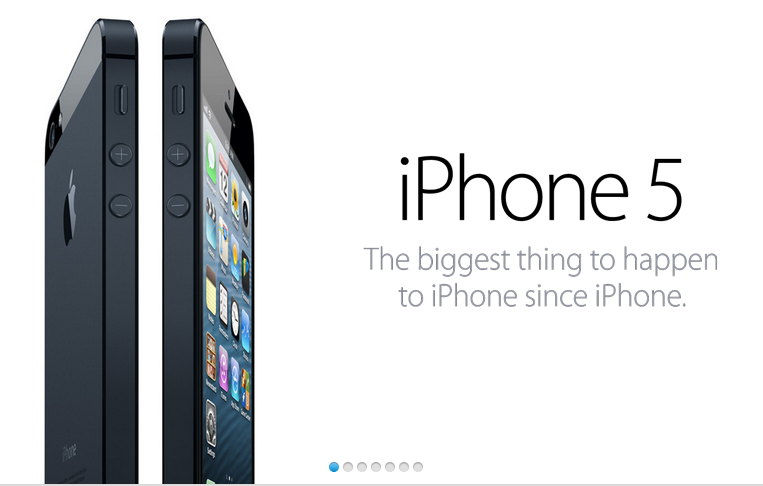
One example of a company that uses white space to produce balance is Apple. With Apple banners, the white space is actually white because it complements the color of the products. Apple chooses a minimalist approach that has proven successful for the company. In a world where flashy advertisements constantly vie for viewer attention, Apple’s simple approach is refreshing to the eye.
Effects That Asymmetry Can Produce
The second a designer adds asymmetry to his creative arsenal, he becomes a more versatile designer. Throwing symmetry to the wind can communicate many different ideas. Some of the most notable include:
Serenity
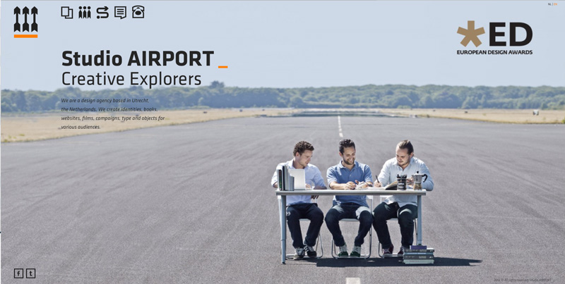
Nicely balanced designs with a lot of white space, like the STUDIO Airport website, give viewers the impression of elegance and quality.
Chaos
If the design calls for something a little edgier, feel free to harness the off-kilter effect that asymmetry produces when the balance is slightly shifted.
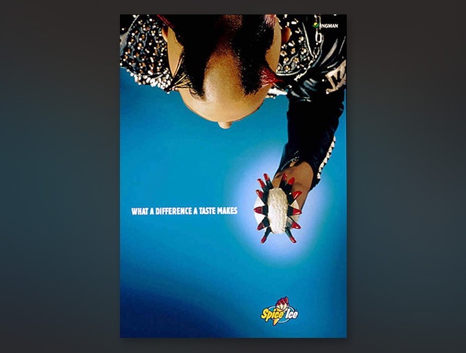
Motion
Asymmetry can be used to make motion-centered photo like the one below seem more life-like.

Why Bother?
Asymmetry is an unapologetic way to bring the focal point of your piece to attention. It can intensify a design or simply show users something different. This powerful design concept may be difficult to master, but it makes your work more memorable for your audience. Viewers are sure to appreciate this much-needed deviation from the norm.
Header image created using neourban hipster office desktop by RaumRot.
